
SUPER ASIA
Type Creative Direction, Identity, Webdesign, Print, Campaign
Field Commerce
Location UK
Year 2018-19
A flexible and fun identity for an esteemed ethnic supermarket in Glasgow.
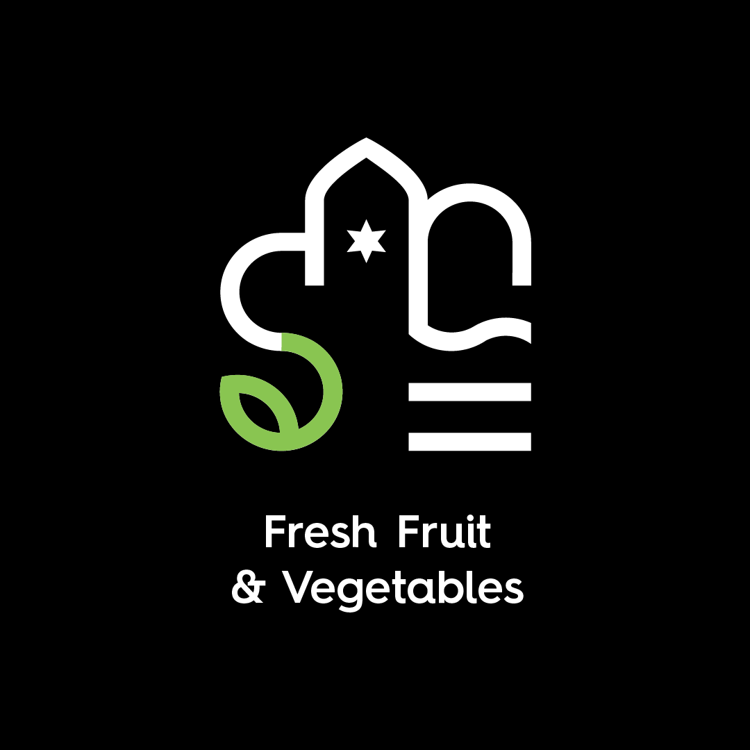
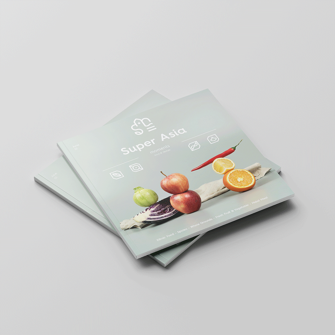
We were approached to create a new visual identity for Super Asia. Our aim and focus was to reflect the high quality and freshness of the products, and to create a modern brand that would reach a wider group of customers. Inspired by Islamic geometric tiles and ornaments, we created a flexible brand language based on the four leading families of products: Fresh fruit & vegetables, essential ingredients, ethnic food & ingredients and quality meat & seafood.
All images by Terramoto Studio
Field Commerce
Location UK
Year 2018-19
A flexible and fun identity for an esteemed ethnic supermarket in Glasgow.
We were approached to create a new visual identity for Super Asia. Our aim and focus was to reflect the high quality and freshness of the products, and to create a modern brand that would reach a wider group of customers. Inspired by Islamic geometric tiles and ornaments, we created a flexible brand language based on the four leading families of products: Fresh fruit & vegetables, essential ingredients, ethnic food & ingredients and quality meat & seafood.
All images by Terramoto Studio


CREATIVE DIRECTION
GRAPHIC DESIGN
STRATEGY
ADVERTISING
PHOTOGRAPHY
TERRAMOTO STUDIO
RETHINKING DESIGN ON SHAKY GROUND
Based in Porto, Portugal
Working worldwide
info@terramoto.studio
@terramoto.studio
RETHINKING DESIGN ON SHAKY GROUND
Based in Porto, Portugal
Working worldwide
info@terramoto.studio
@terramoto.studio


TERRAMOTO STUDIO
RETHINKING DESIGN ON A SHAKY GROUND
Based in Porto, Portugal
Working worldwide
PROJECTS EPICENTRE ABOUT IG
©2024 All rights reserved