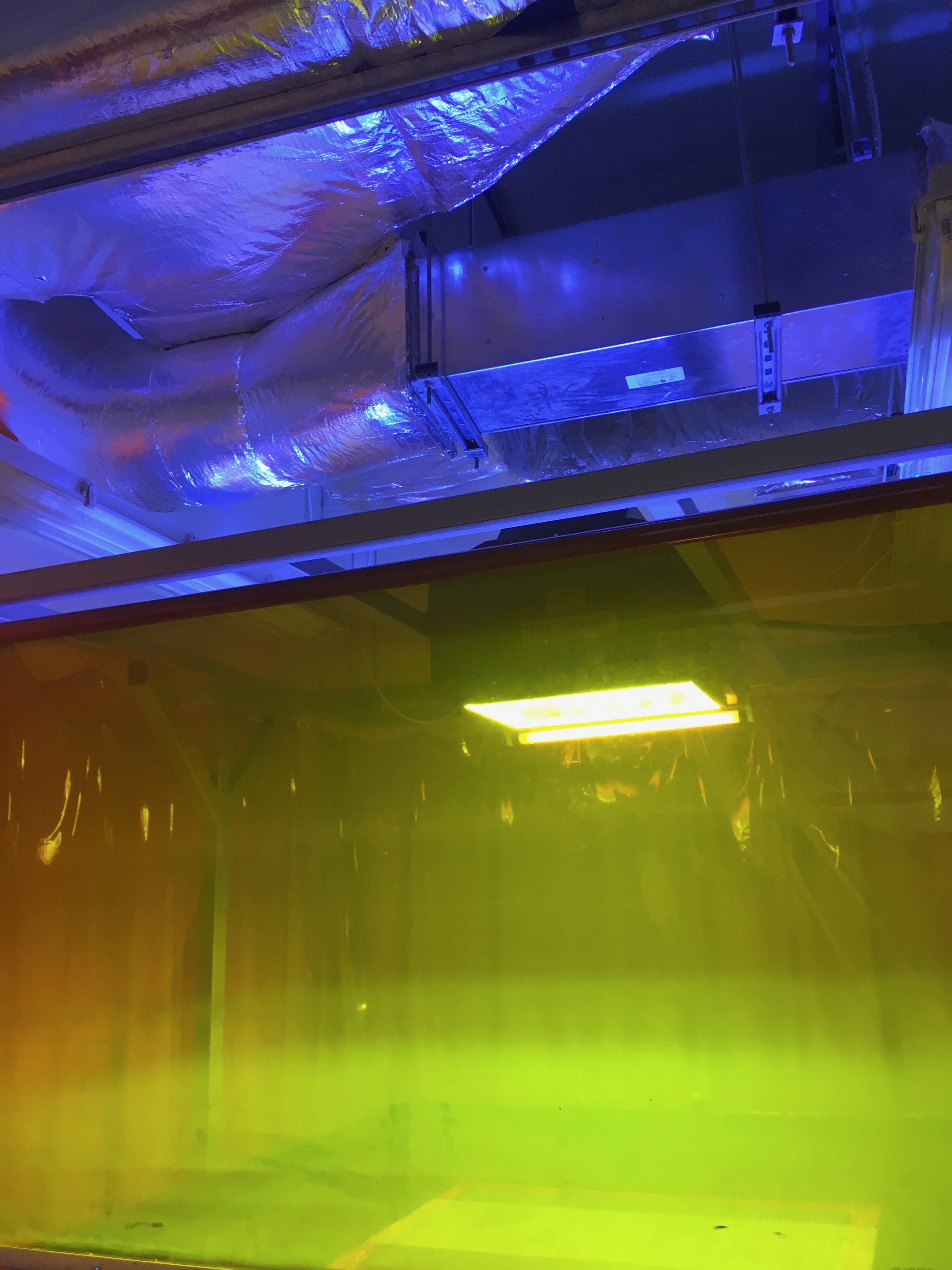
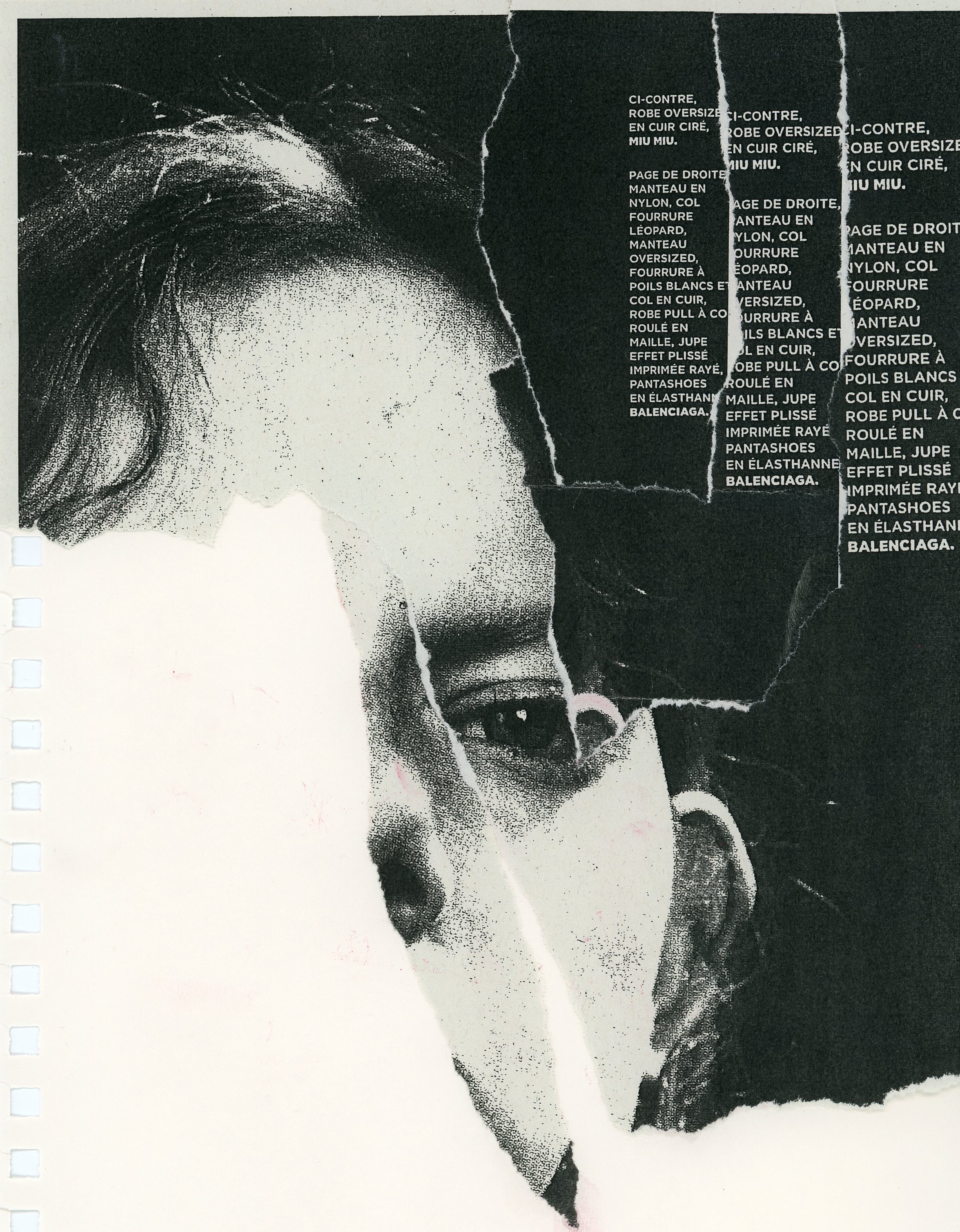
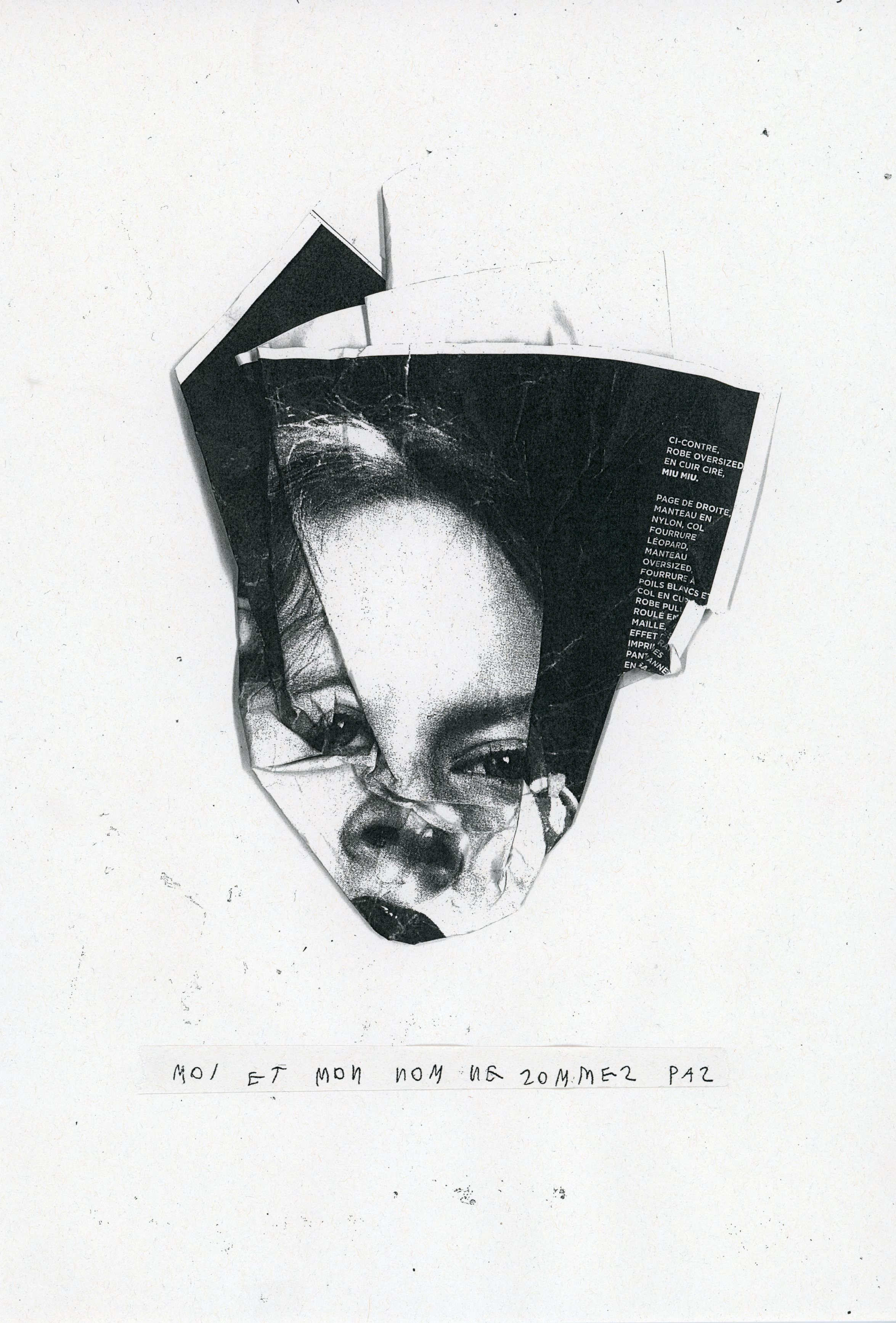
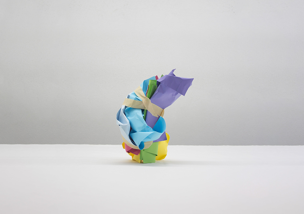
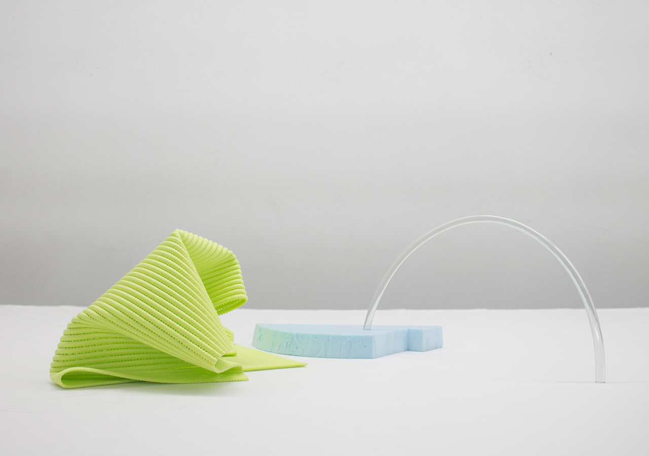
The Epicentre is the core from where ideas emerge like shockwaves.
Everyday routine, objects or resonant thoughts spark experimental projects we develop alongside our work with brands.
This is the playground for our creativity, a space that keeps us sharp, curious and motivated to act on the world we live in.
Everyday routine, objects or resonant thoughts spark experimental projects we develop alongside our work with brands.
This is the playground for our creativity, a space that keeps us sharp, curious and motivated to act on the world we live in.

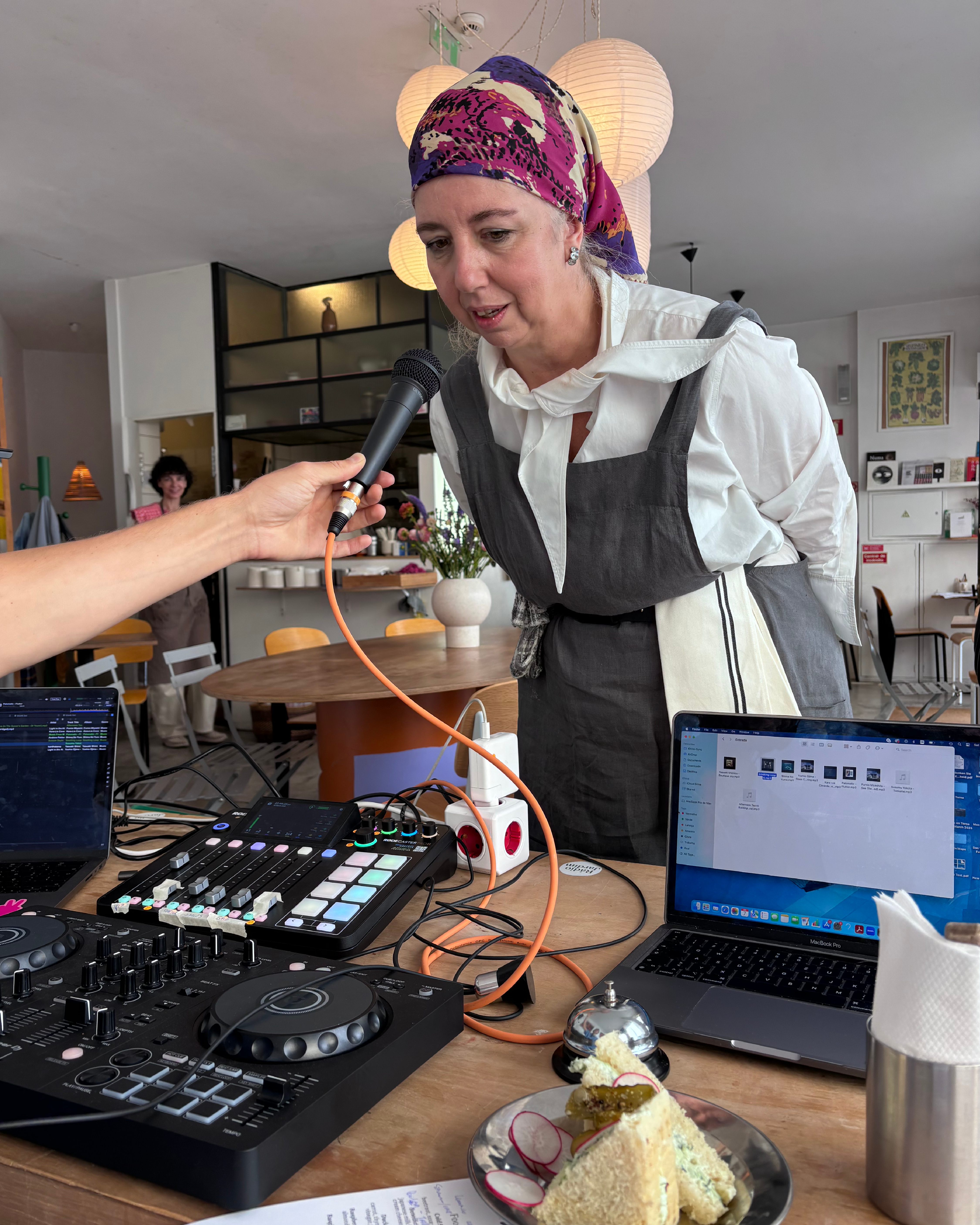
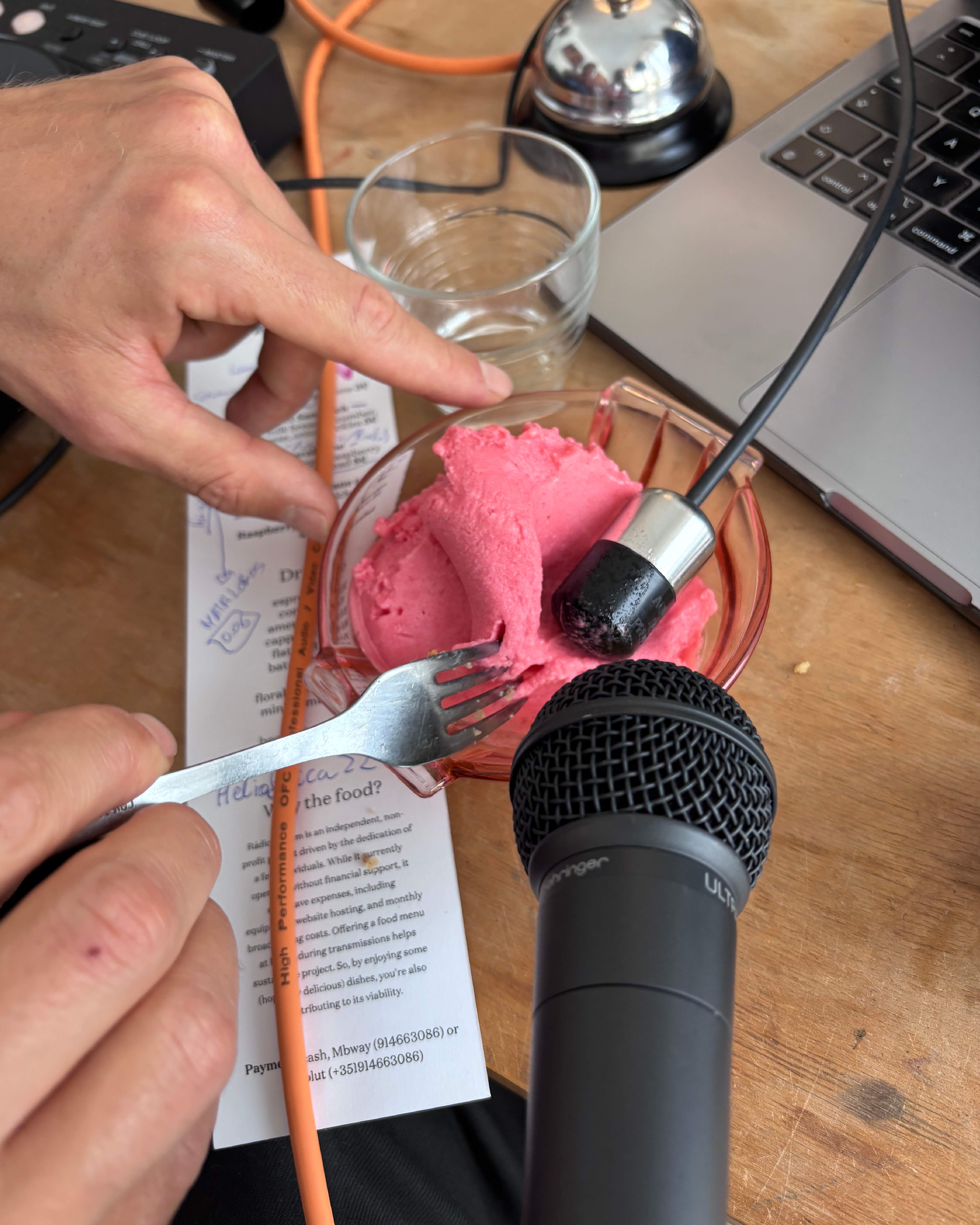
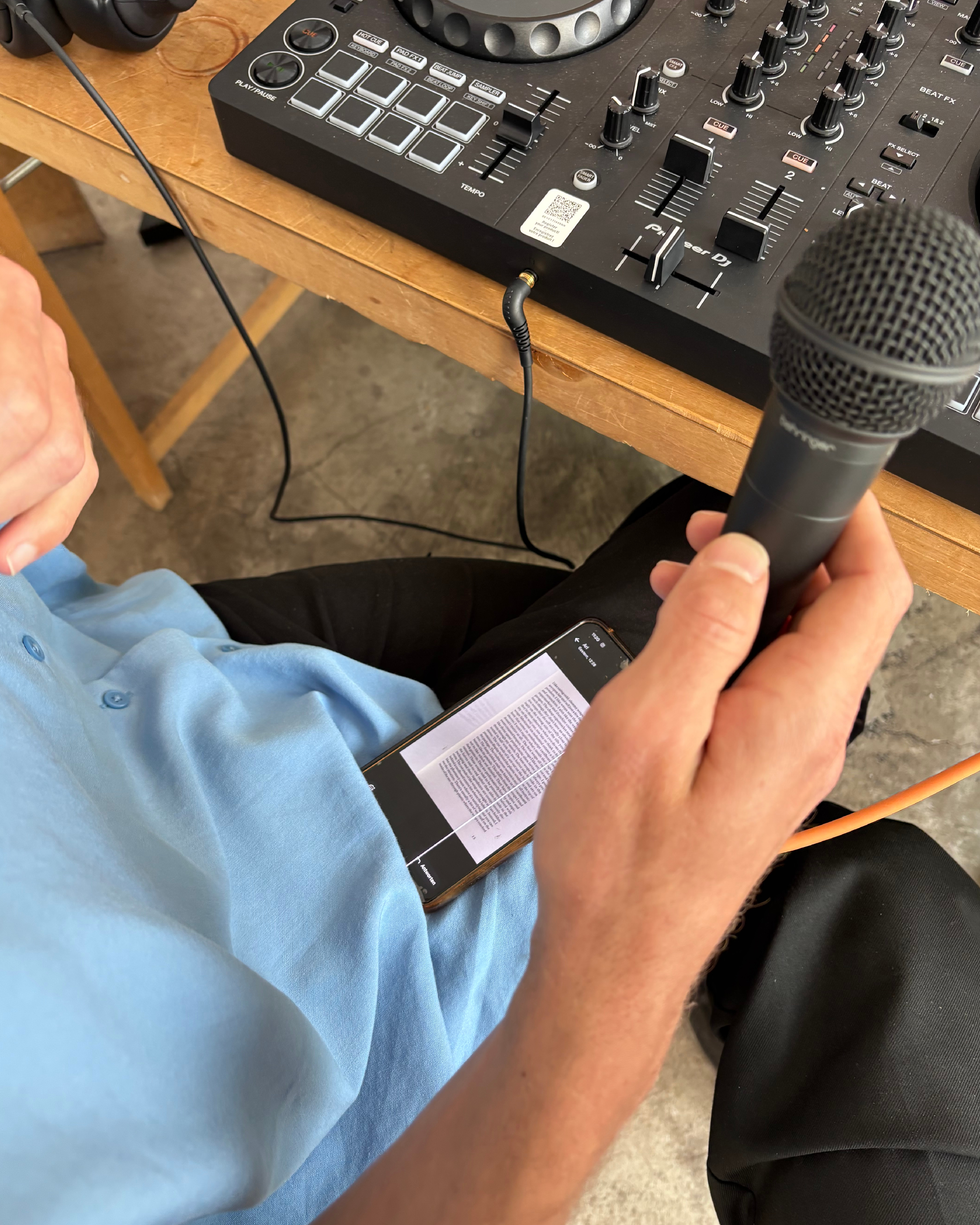
Radio Show
Terramoto Studio + Max Parnell
for Radio Jardim at época, summer 2025
On 7th of June 2025, we hosted a two-hour radio show with @radio.jardim at @epocaporto — our first time doing something like this. Luckily, we felt in safe hands next to @m__parnell , our longest-standing collaborator and a radio veteran with amazing shows at @systems.radio & @cashmere_radio
Época prepared five dishes to welcome Radio Jardim and its listeners, and we curated music to pair with each one.
We divided the show into five chapters (starters, mains, desserts…), and in between, we asked a few questions to the Época team, gave some poetic readings on sandwiches, forgot to turn off the mic once or twice, and played around with contact mics in our food, creating sounds which we hope will go down as well as the beautiful dishes did.
All in all, we had a lot of fun!
If you’d like to listen back, check the link in @radio.jardim bio — or go to www.radiojardim.net
Big thanks to @o_gui from @radio.jardim for making this happen and going along with our ideas — and to @epocaporto for the amazing food and good vibes.
youtube︎︎︎


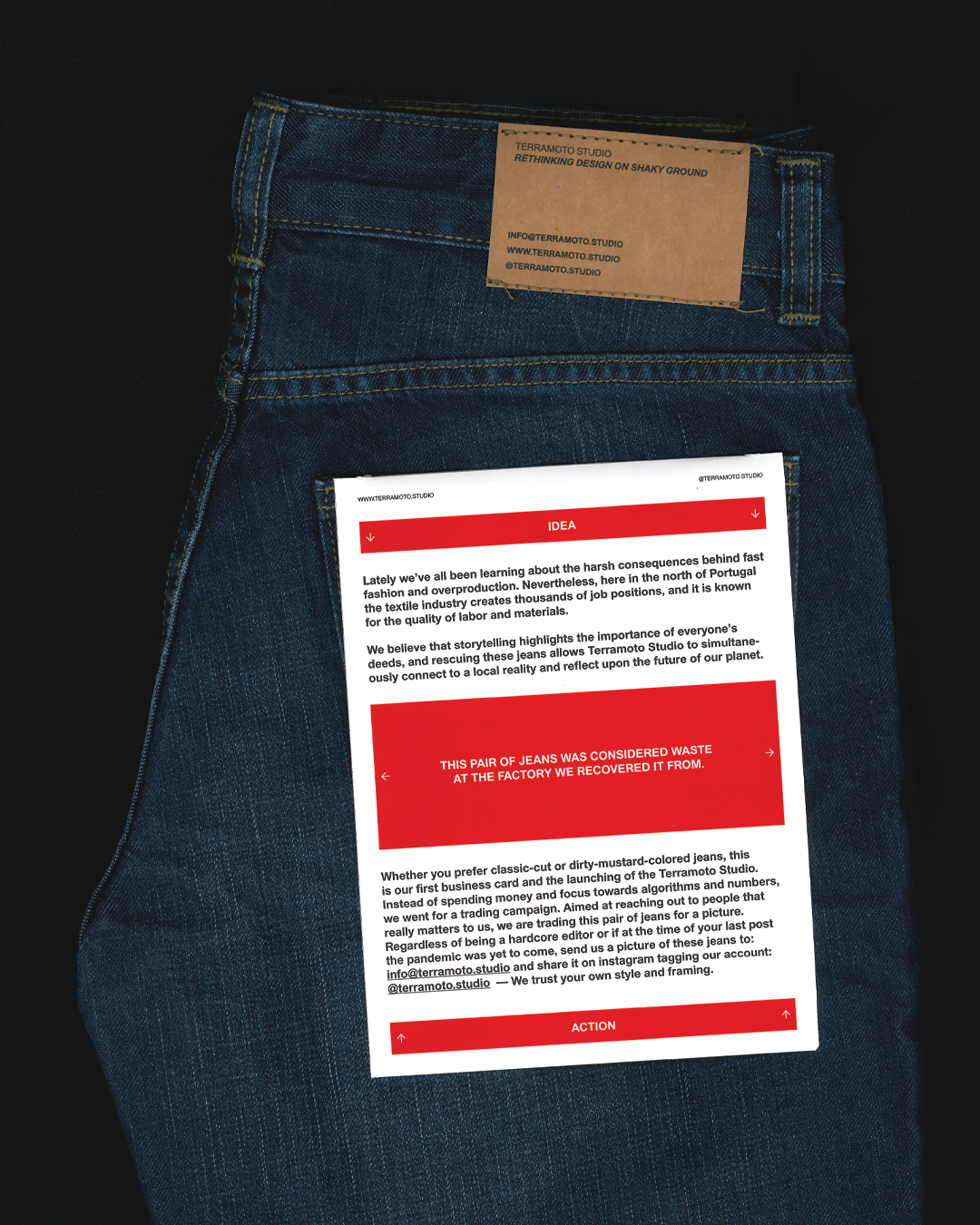
Business Card 01
Ask us one!
They are free like any business cards︎︎︎
We have made it!
One year of Terramoto Studio 💥️
To celebrate this, we have decided to produce and send these unique ‘business cards’ to reconnect with past collaborators, and to connect to people we would like to collaborate with in future.
These jeans are made from customised waste, rescued from textile factories in the north of Portugal. Each pair is unique and has never been worn. If they don’t fit you, give them to someone else.


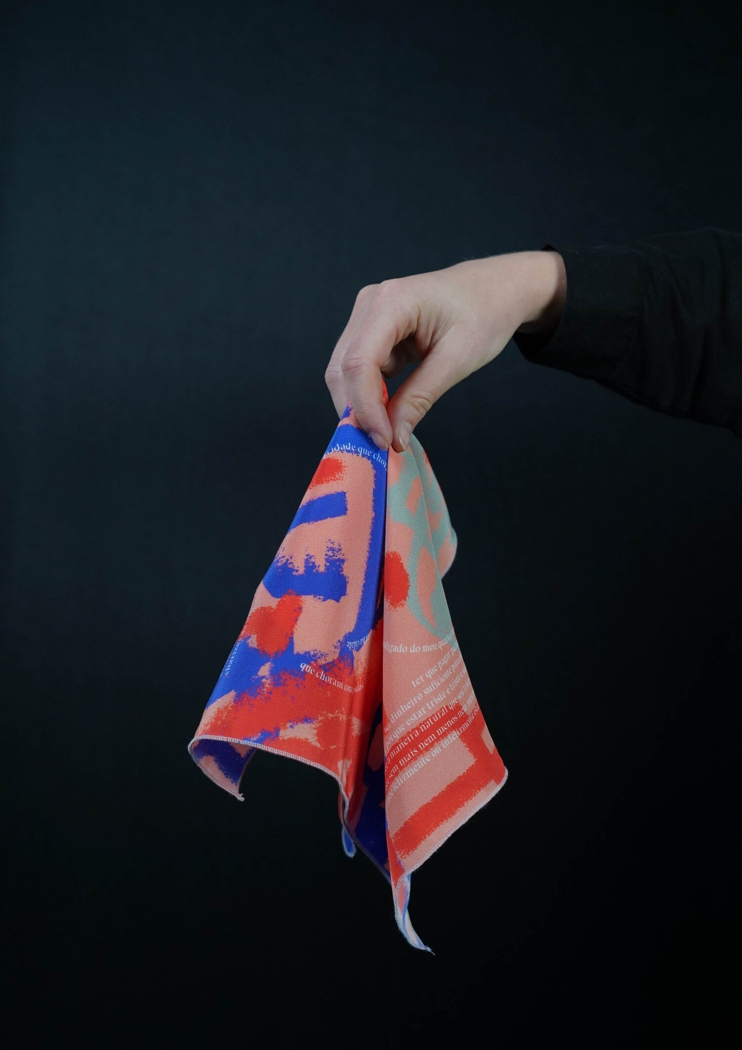
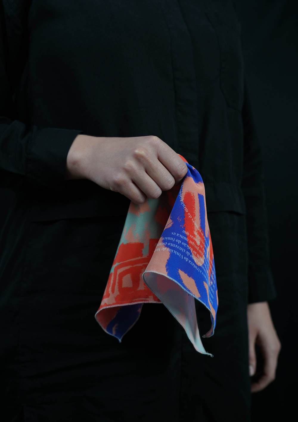
Publication 03
Title: Triste
Writing: Rui da Silva
Illustration: Saskia Cameron
Edition of twenty
Buy — last ones︎︎︎
Material: 100% Silk with digital prinitng
The third issue is a silk handkerchief.
The text written by Rui da Silva reminds us of a goodbye letter and a melancholic, nostalgic feeling about personal space, memories and places that the character has not yet visited but hopes to someday.
All these descriptions and dreams led the designer to create a story about a WW2 aviator and the thought that surely goes through their minds, in the final moments, when they realise the aeroplane they’re in is about to shut down.

Publication 02
Back of a napkin
Writings: Max Parnell
Edition of twelve
Sold out
Material: Stainless Steel Napkin Holder
5 x 3.75" (12.75 x 9.5cm)
40 silk screened napkis + 2 (cover) foil in letter press
The second issue is a simple metal napkin holder.
The reference that shapes this second issue is the habit of people using these napkins in cafés and restaurants to quickly sketch and explain their ideas. Inside the napkin holder are forty napkins, twenty (orange) titles and another twenty (black) the haikus. The written content is based on an invention or technological progression from 2018-2019 written by Max Parnell. With the napkin being a disposable material of low-quality paper, typically used and disposed of casually, it comes as a rupture to find complex ideas carefully woven into them.
There is no right or wrong way to interact with this issue.


Publication 01
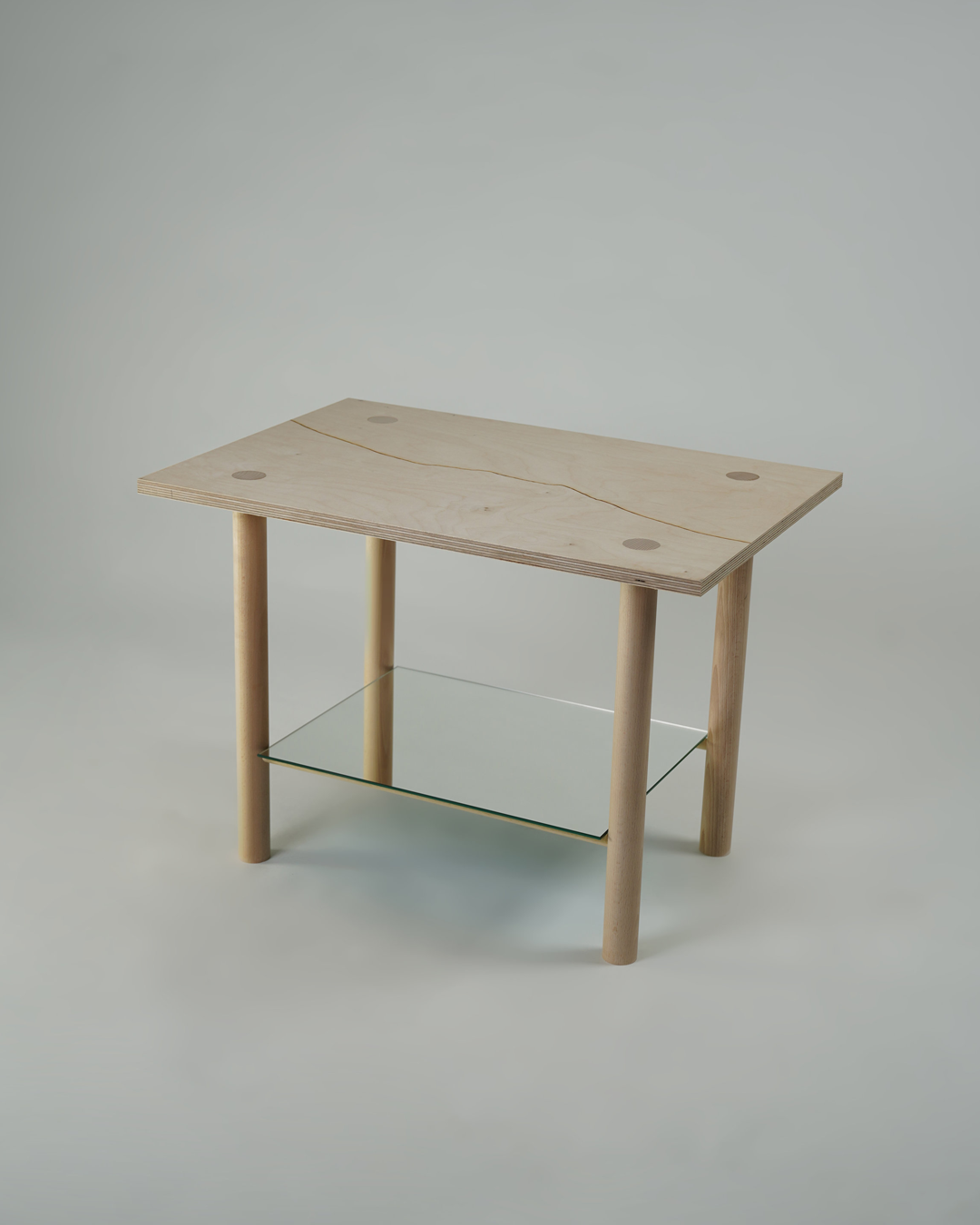
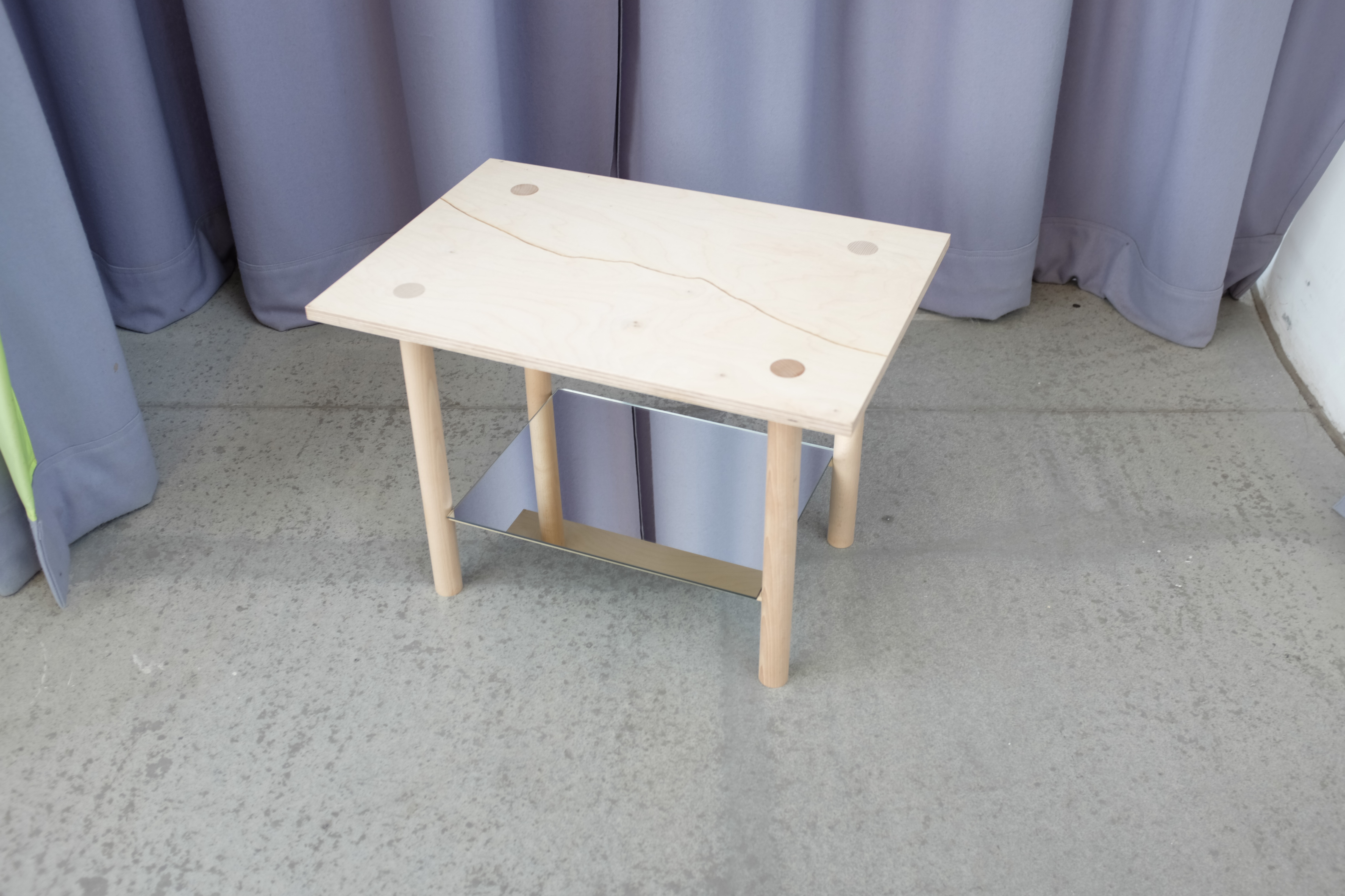
Title: Duck, cover, hold on
— Manifesto
Editions of two
Sold out
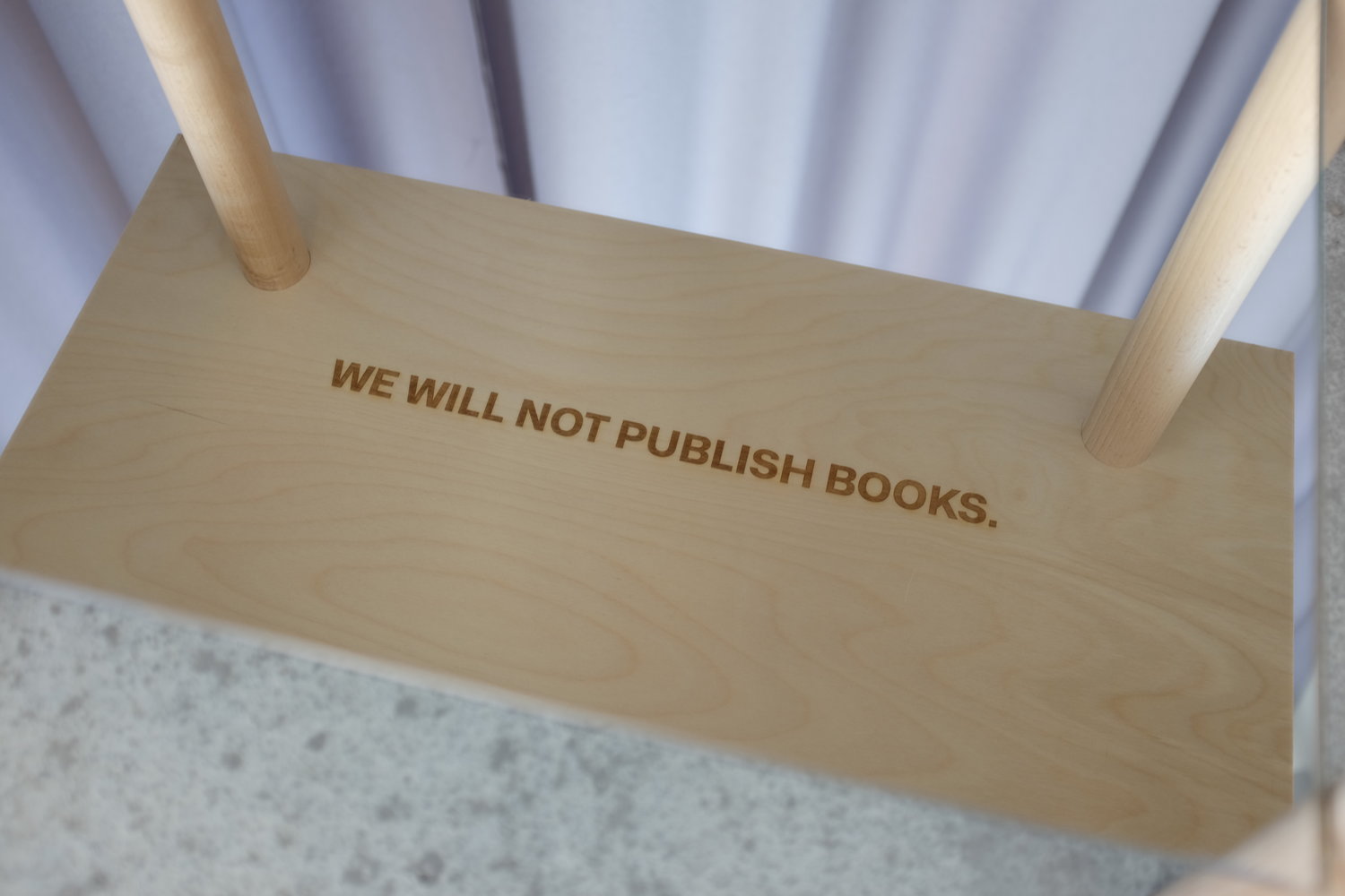
Material: Plywood top with engraving Terramoto logo (top) and quote “WE WILL NOT PUBLISH BOOK.”(underneath), timberwood legs and mirror;
H50 X W70 X D48 cm
The first issue is a modest wooden table. The reference that shapes this first issue is one popular safety measure that people must take in case of an earthquake.
The top of the table features an engraving of the logo which represents the rupture of Terramoto publisher. Underneath (safe place) you can read the engraving “We will not publish books.". This phrase illustrates the publisher’s manifesto, and is only readable to the viewer when they interact with the piece.
In order to read the quote, the viewer must get close to the piece. As they approach closer, the reflection of the mirror will reveal the writing, with the mirror works as a mediator between the viewer and the writing. Through only becoming visible when viewers come close to the piece, it evokes the feeling and notion of been underneath it.
Title: Duck, cover, hold on
— Manifesto
Editions of two
Sold out
Material: Plywood top with engraving Terramoto logo (top) and quote “WE WILL NOT PUBLISH BOOK.”(underneath), timberwood legs and mirror;
H50 X W70 X D48 cm
The first issue is a modest wooden table. The reference that shapes this first issue is one popular safety measure that people must take in case of an earthquake.
The top of the table features an engraving of the logo which represents the rupture of Terramoto publisher. Underneath (safe place) you can read the engraving “We will not publish books.". This phrase illustrates the publisher’s manifesto, and is only readable to the viewer when they interact with the piece.
In order to read the quote, the viewer must get close to the piece. As they approach closer, the reflection of the mirror will reveal the writing, with the mirror works as a mediator between the viewer and the writing. Through only becoming visible when viewers come close to the piece, it evokes the feeling and notion of been underneath it.


︎Epicentre
The Epicentre is the core from where ideas emerge like shockwaves.
Everyday routine, objects or resonant thoughts spark experimental projects we develop alongside our work with brands.
This is the playground for our creativity, a space that keeps us sharp, curious and motivated to act on the world we live in.
Radio Show
Terramoto Studio + Max Parnell
for Radio Jardim at época, summer 2025


On 7th of June 2025, we hosted a two-hour radio show with @radio.jardim at @epocaporto — our first time doing something like this. Luckily, we felt in safe hands next to @m__parnell , our longest-standing collaborator and a radio veteran with amazing shows at @systems.radio & @cashmere_radio
Época prepared five dishes to welcome Radio Jardim and its listeners, and we curated music to pair with each one.
We divided the show into five chapters (starters, mains, desserts…), and in between, we asked a few questions to the Época team, gave some poetic readings on sandwiches, forgot to turn off the mic once or twice, and played around with contact mics in our food, creating sounds which we hope will go down as well as the beautiful dishes did.
All in all, we had a lot of fun!
If you’d like to listen back, check the link in @radio.jardim bio — or go to www.radiojardim.net
Big thanks to @o_gui from @radio.jardim for making this happen and going along with our ideas — and to @epocaporto for the amazing food and good vibes.
Youtube︎︎︎
Business Card 01
Ask us one, they are free like any business cards︎︎︎


We have made it!
One year of Terramoto Studio 💥️
To celebrate this, I have decided to produce and send these unique ‘business cards’ to reconnect with past collaborators, and to connect to people I would like to collaborate with in future.
These jeans are made from customised waste, rescued from textile factories in the north of Portugal. Each pair is unique and has never been worn. If they don’t fit you, give them to someone else.
Publication 03
Title: Triste
Writings: Rui da Silva
Illustration: Saskia Cameron
Edition of twenty
Buy — last ones︎︎︎
Material: 100% Silk with digital prinitng
The third issue is a silk handkerchief.
The text written by Rui da Silva reminds us of a goodbye letter and a melancholic, nostalgic feeling about personal space, memories and places that the character has not yet visited but hopes to someday.
All these descriptions and dreams led the designer to create a story about a WW2 aviator and the thought that surely goes through their minds, in the final moments, when they realise the aeroplane they’re in is about to shut down.
Publication 02
Back of a napkin
Writings: Max Parnell Art Direction & production: Terramoto Studio
Edition of twelve
Sold out
Material: Stainless Steel Napkin Holder 5 x 3.75" (12.75 x 9.5cm)
40 silk screened napkis + 2 (cover) foil in letter press
The second issue is a simple metal napkin holder.
The reference that shapes this second issue is the habit of people using these napkins in cafés and restaurants to quickly sketch and explain their ideas. Inside the napkin holder are forty napkins, twenty (orange) titles and another twenty (black) the haikus. The written content is based on an invention or technological progression from 2018-2019 written by Max Parnell. With the napkin being a disposable material of low-quality paper, typically used and disposed of casually, it comes as a rupture to find complex ideas carefully woven into them.
There is no right or wrong way to interact with this issue.
Publication 01
Title: Duck, cover, hold on —Manifesto for the Terramoto Publisher
Editions of two
Sold out
Material: Plywood top with engraving Terramoto logo (top) and quote “WE WILL NOT PUBLISH BOOK.”(underneath), timberwood legs and mirror;
H50 X W70 X D48 cm
The first issue is a modest wooden table. The reference that shapes this first issue is one popular safety measure that people must take in case of an earthquake.
The top of the table features an engraving of the logo which represents the rupture of Terramoto publisher. Underneath (safe place) you can read the engraving “We will not publish books.". This phrase illustrates the publisher’s manifesto, and is only readable to the viewer when they interact with the piece.
In order to read the quote, the viewer must get close to the piece. As they approach closer, the reflection of the mirror will reveal the writing, with the mirror works as a mediator between the viewer and the writing. Through only becoming visible when viewers come close to the piece, it evokes the feeling and notion of been underneath it.