SPECIAL PROJECTS
Type Visual Identity, Brand Guidelines, Print, Uniform Design
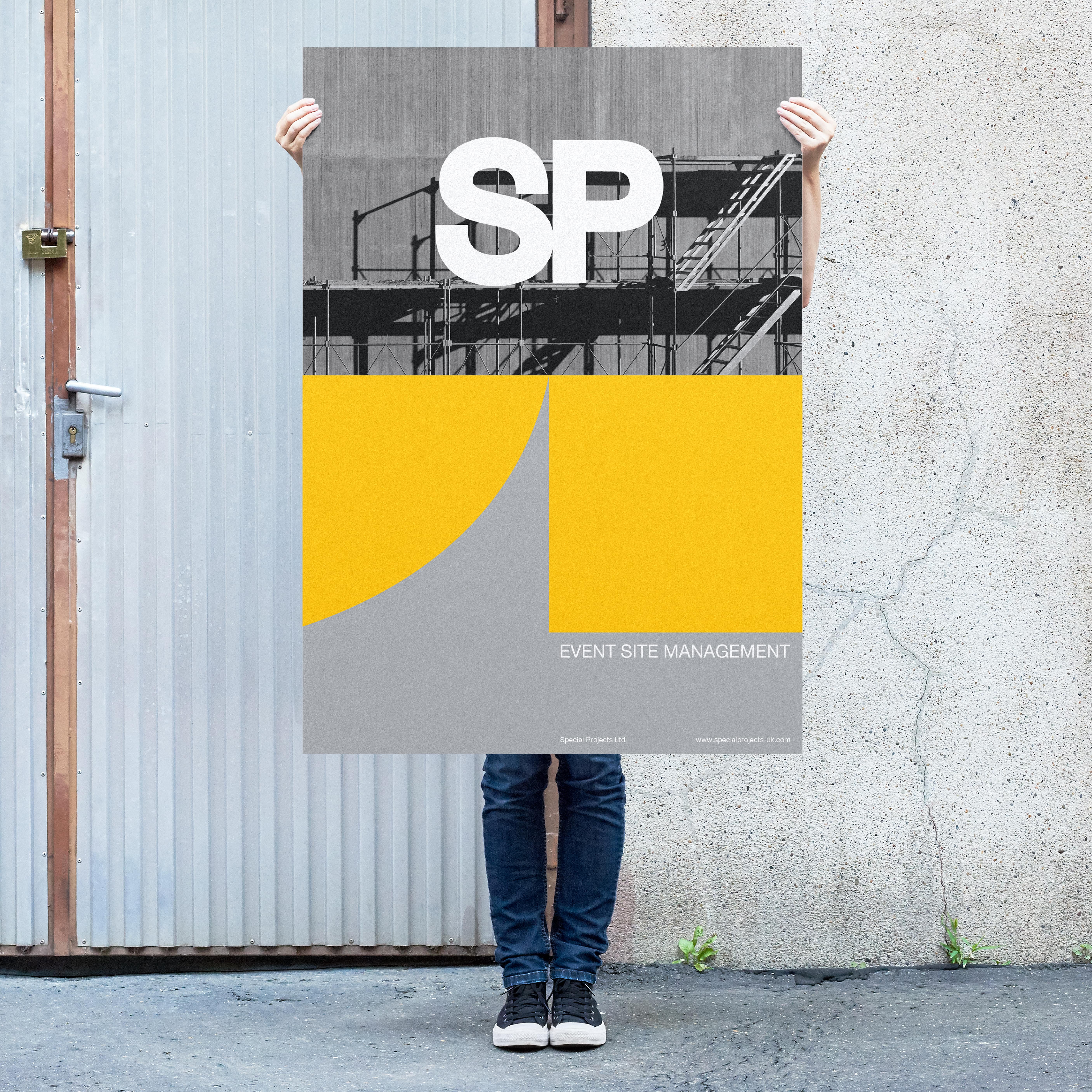
Field Event Management
Location UK
Year 2022-23
- Project and site management for large-scale outdoor festivals.
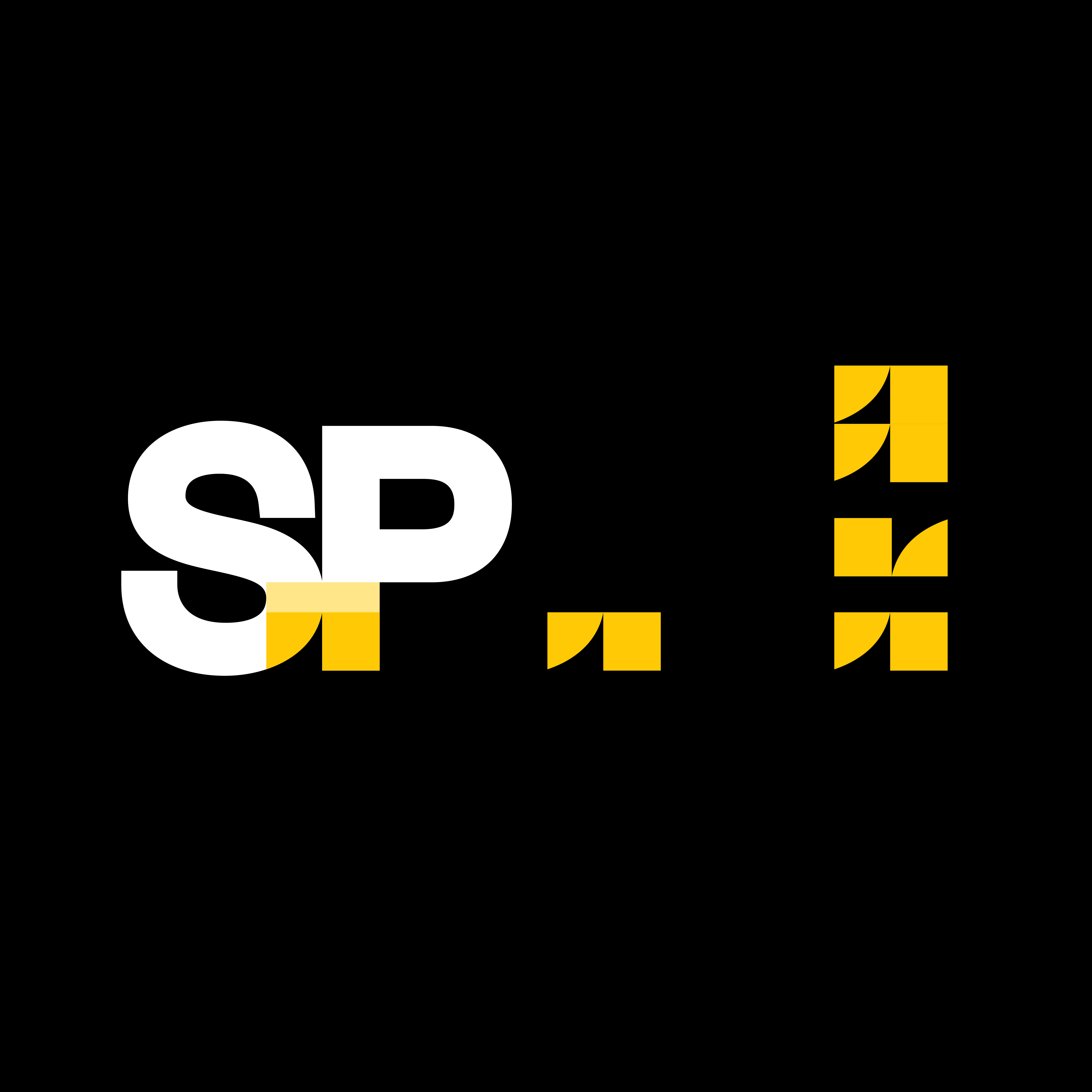
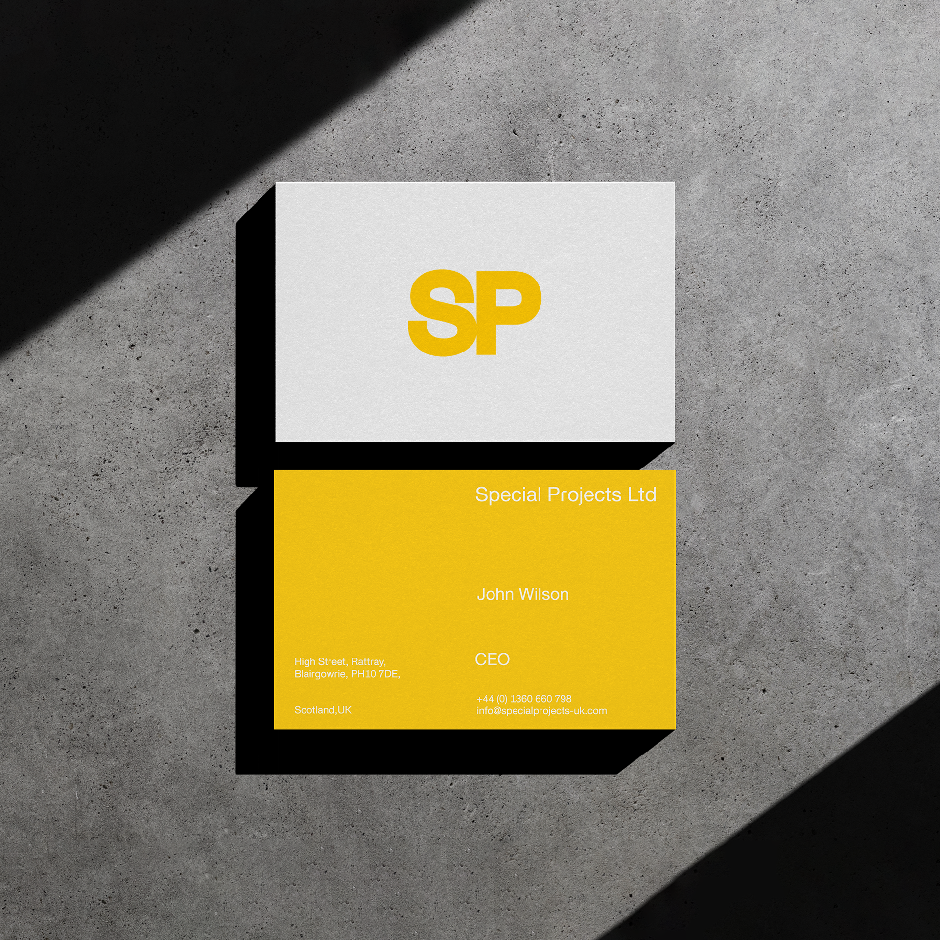
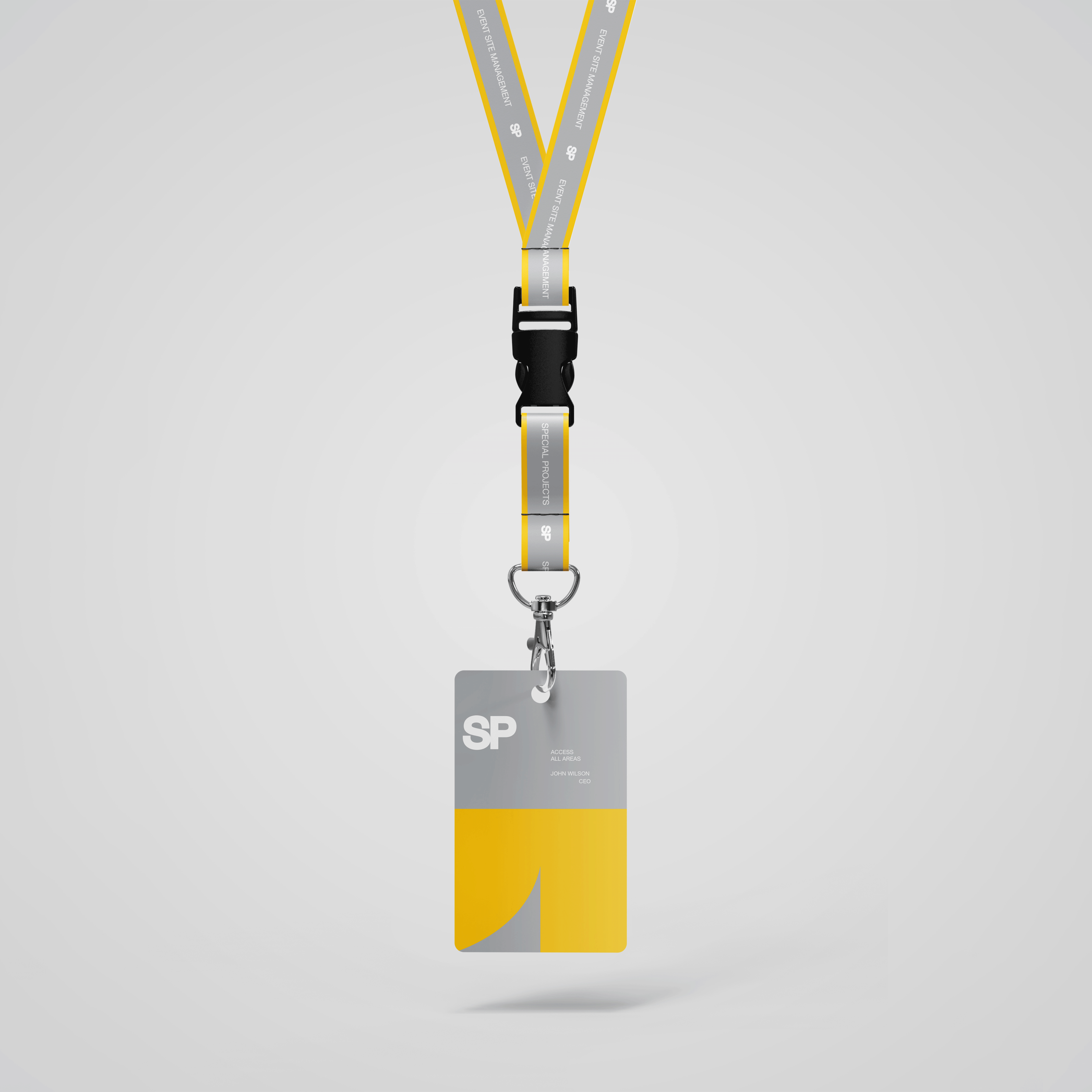
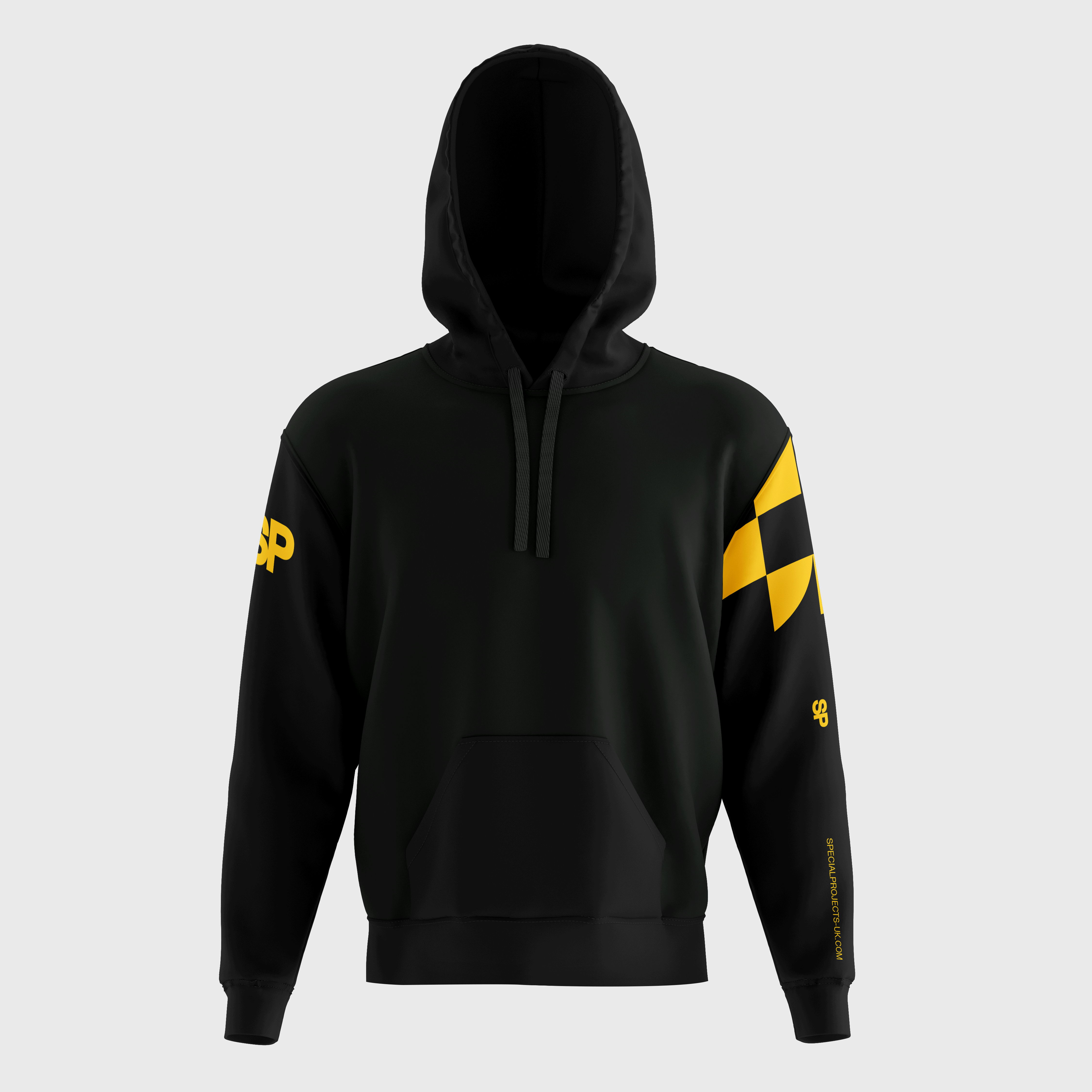
Special Projects UK reached out for a rebrand of their existing logo and creation of a new visual identity that would improve their efficiency when working on large-scale event sites.
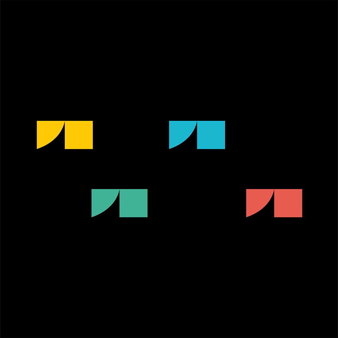
Since SP works worldwide, the site team has a tendency to change frequently, making it difficult for workers to know who’s on the team and which department they’re working on. So we redesigned their logo, using their previous one as the main reference, as requested by the client. We then used the same visual language to create four sub-brands, all of which share the same colour so they can be easily identifiable on site.
We took the shape that connects the letters S and P from the main typo-logo, to represent the united spirit and teamwork that the company is known for and created new shapes that can be used as part of their visual identity.
Field Event Management
Location UK
Year 2022-23
- Project and site management for large-scale outdoor festivals.
Special Projects UK reached out for a rebrand of their existing logo and creation of a new visual identity that would improve their efficiency when working on large-scale event sites.
Since SP works worldwide, the site team has a tendency to change frequently, making it difficult for workers to know who’s on the team and which department they’re working on. So we redesigned their logo, using their previous one as the main reference, as requested by the client. We then used the same visual language to create four sub-brands, all of which share the same colour so they can be easily identifiable on site.
We took the shape that connects the letters S and P from the main typo-logo, to represent the united spirit and teamwork that the company is known for and created new shapes that can be used as part of their visual identity.


BRAND STRATEGY
VISUAL IDENTITY
GRAPHIC DESIGN
ART DIRECTION
NAMING
CAMPAIGNS
COPYWRITING
PHOTOGRAPHY
EDITORIAL DESIGN
WEB DESIGN
RETHINKING DESIGN ON SHAKY GROUND
Porto ︎︎︎ Brussels
Working worldwide
Portuguese–English
︎ Terramoto [noun] Earthquake
Porto ︎︎︎ Brussels
Working worldwide
Portuguese–English
︎ Terramoto [noun] Earthquake