aDrogaria
︎ hardware store [noun] translation of “Drogaria” Portuguese–English
︎ hardware store [noun] translation of “Drogaria” Portuguese–English
Type Creative Direction, Visual Identity, Webdesign, Print, Object Design
Field Arts & Culture
Location Portugal
Year 2021-23
Team Terramoto Studio with aDrogaria
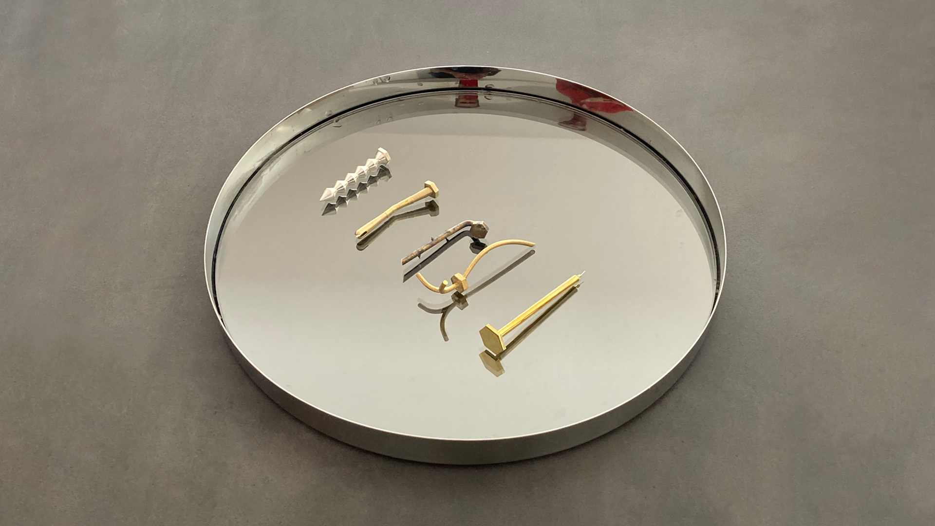
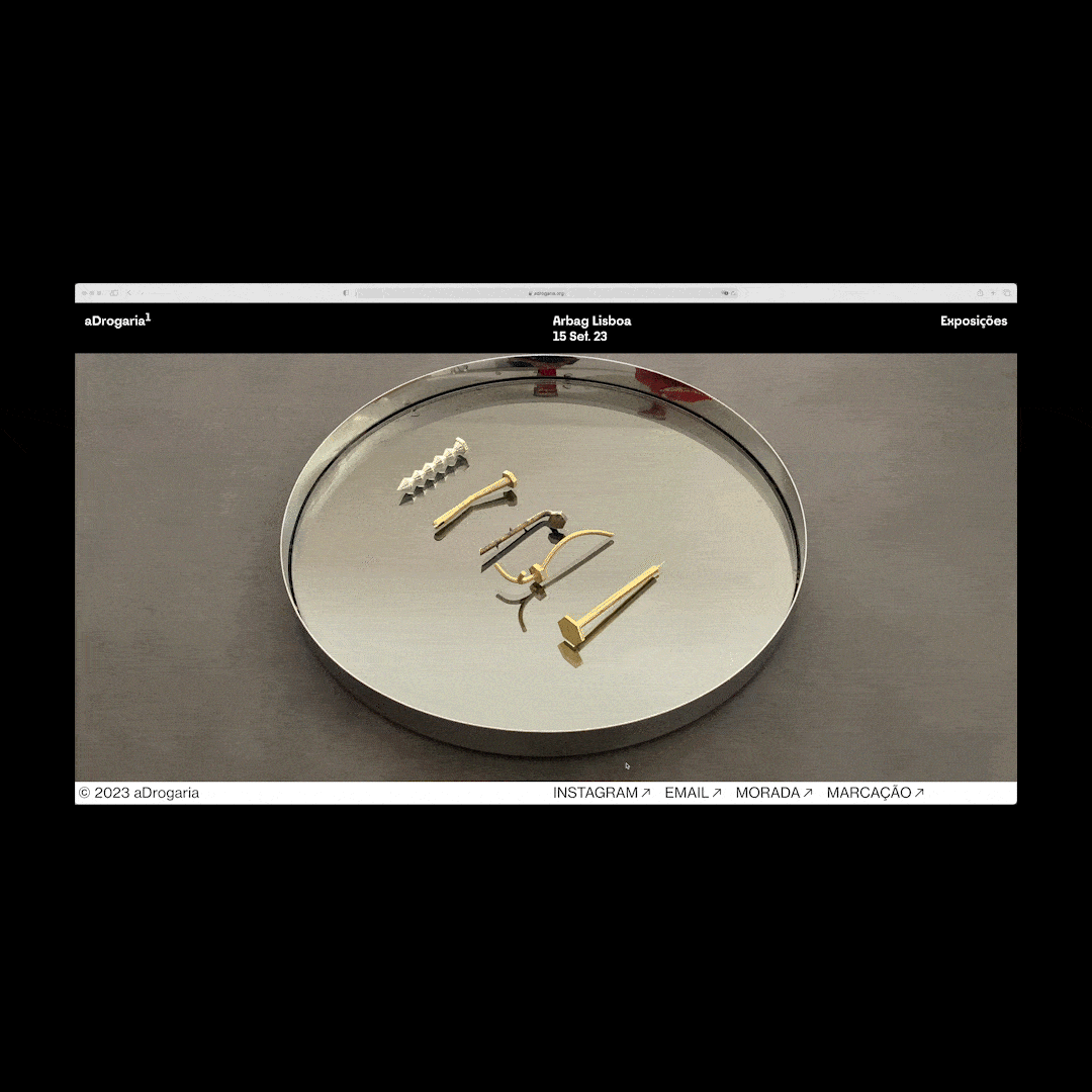
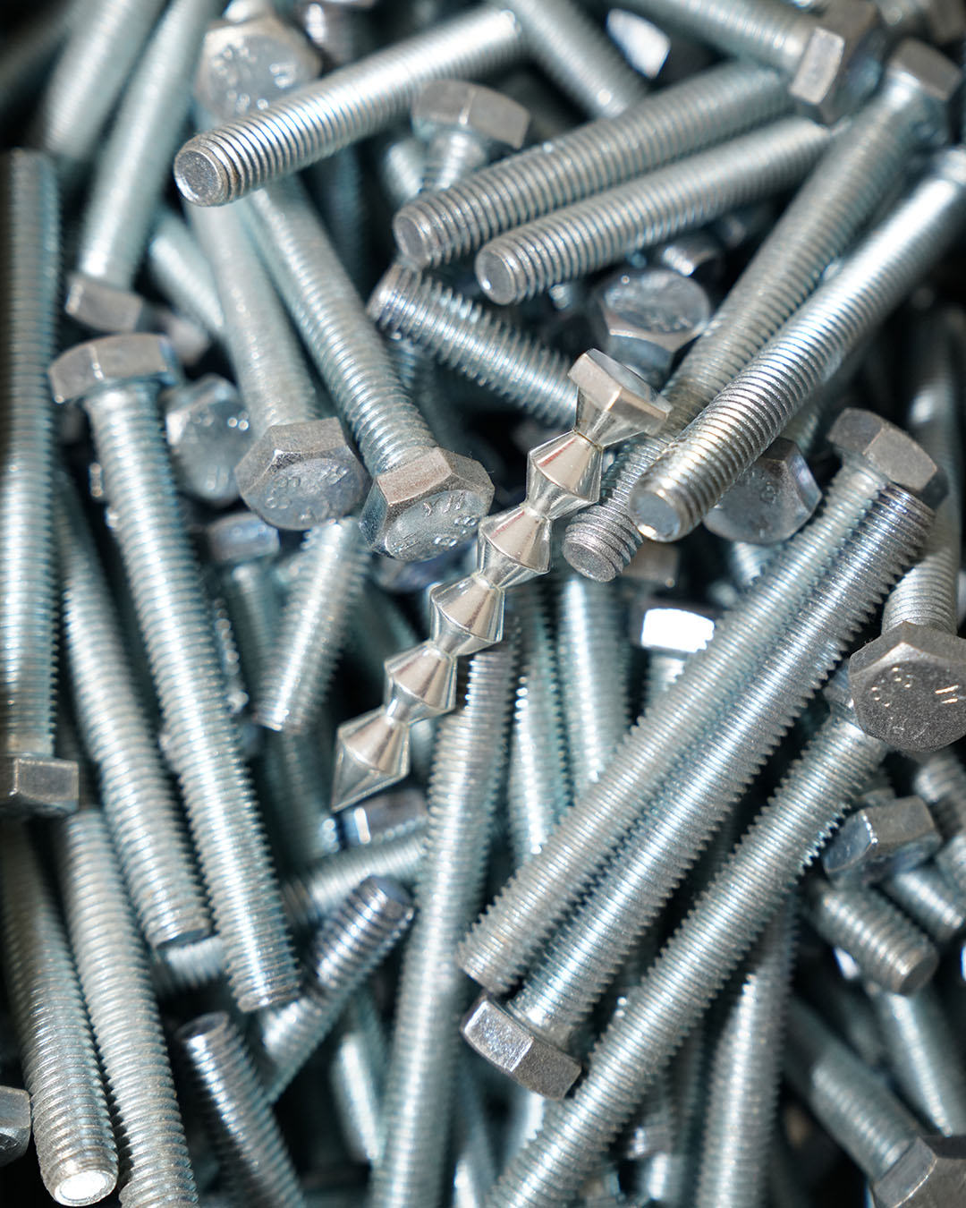
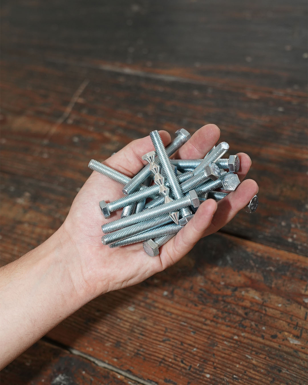
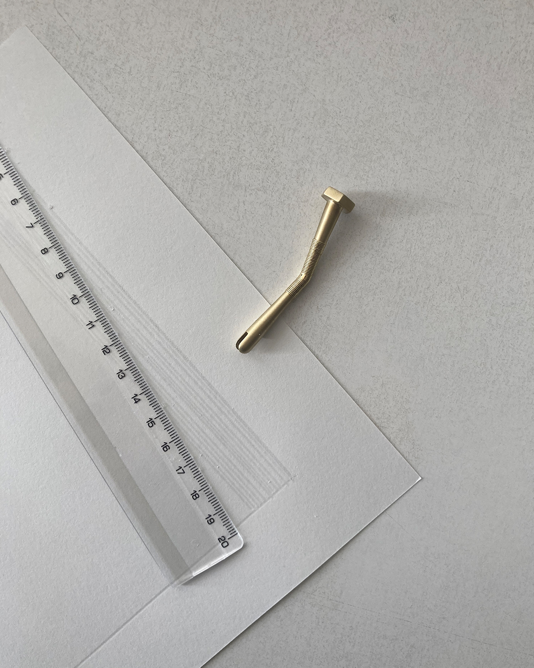
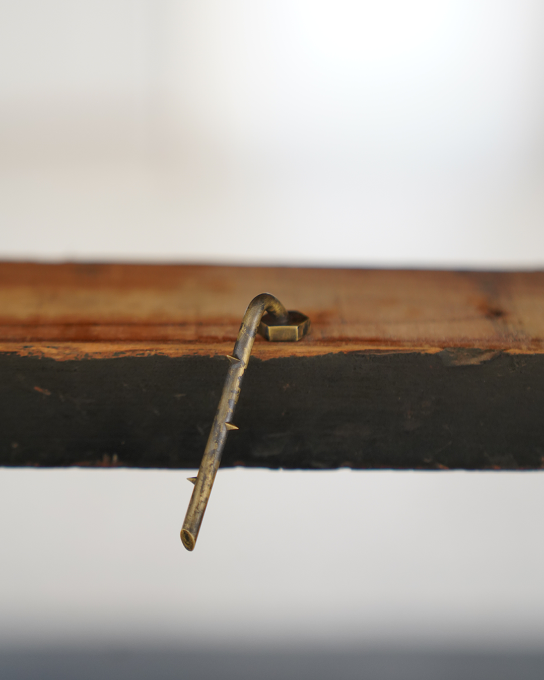
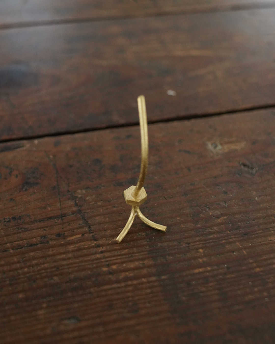
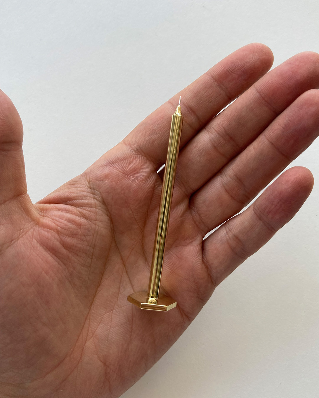
5 exhibitions = 5 screws
aDrogaria is a collective of artists that present exhibitions, events and yearly programs in different spaces.
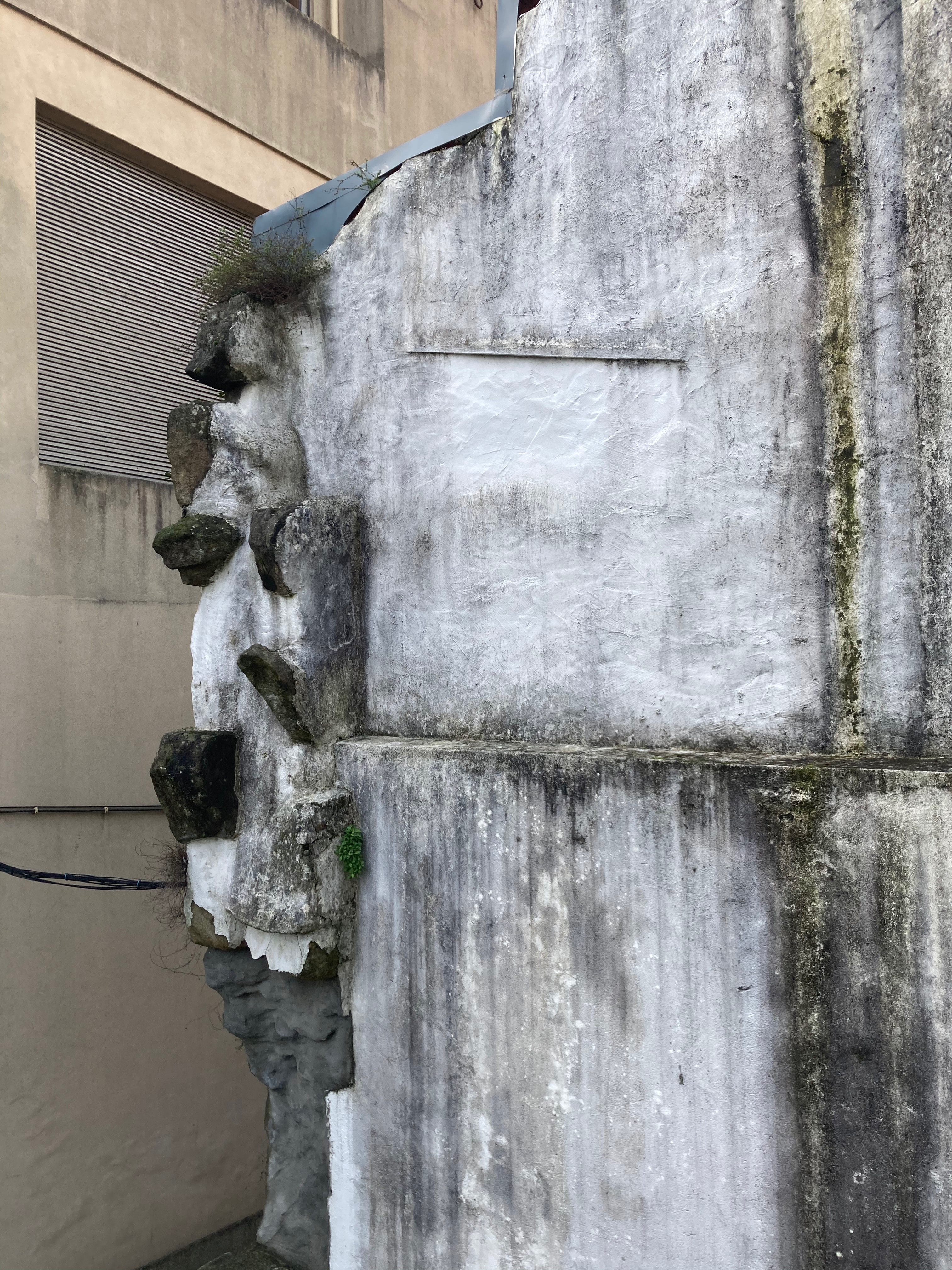
In the first year, the project took place at the ‘aSede’, a gallery in Porto, which was previously a hardware store for over a century, hence the name chosen for the project and the object that represents it.
Why a screw to communicate a series of exhibitions?
The collective was driven to work around the space’s heritage, so when thinking on what to design for the identity of the project we came up with the concept of the screw, instead of a logo, for each exhibition, inspired by the group of artists that would exhibit in each event.
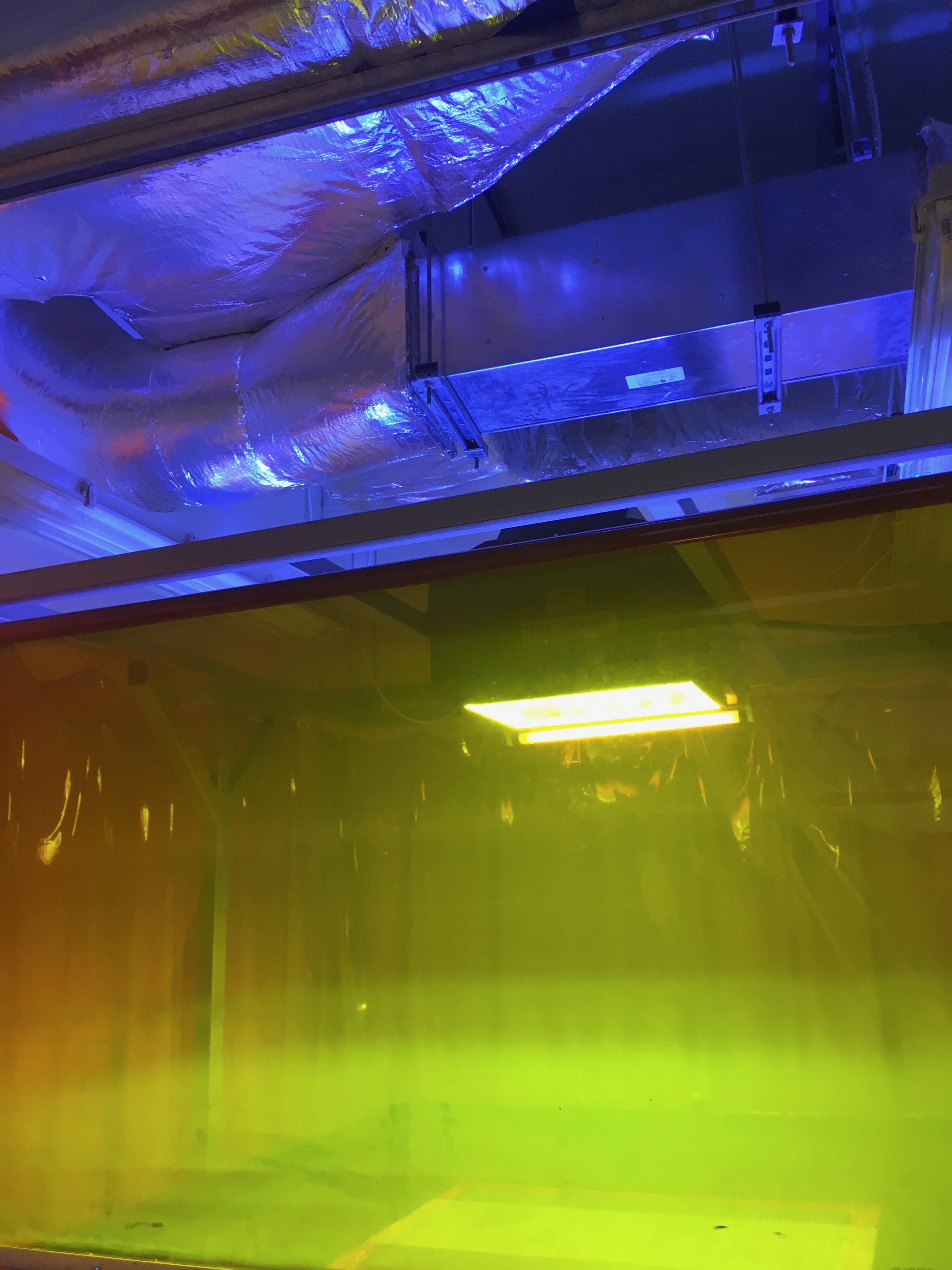
A large part of the content was created without the use of computers, using only our phones to take videos and photos of the screw, placed throughout the gallery space, as well as in the hands of Sr. Benjamim, a long-time worker at the Drogaria.
All five screws were produced in collaboration with a local jeweller. They’re cast from brass and have different finishes: acid, polished and silver-plated.
All images & videos by Terramoto Studio
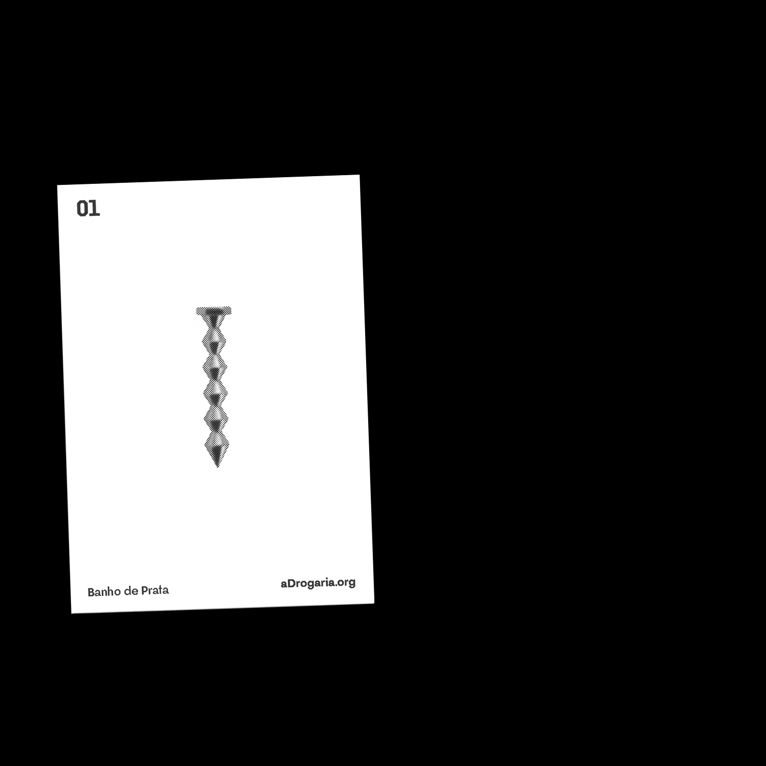
Exhibition Nº 1 — Banho de Prata

Exhibition Nº 2— Barlavento

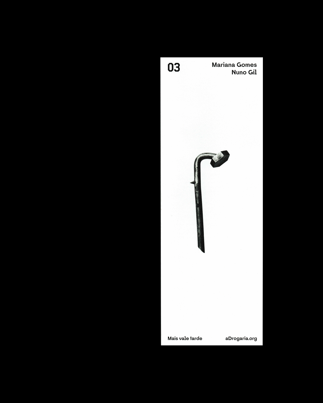
Exhibition Nº 3 — Mais vale tarde

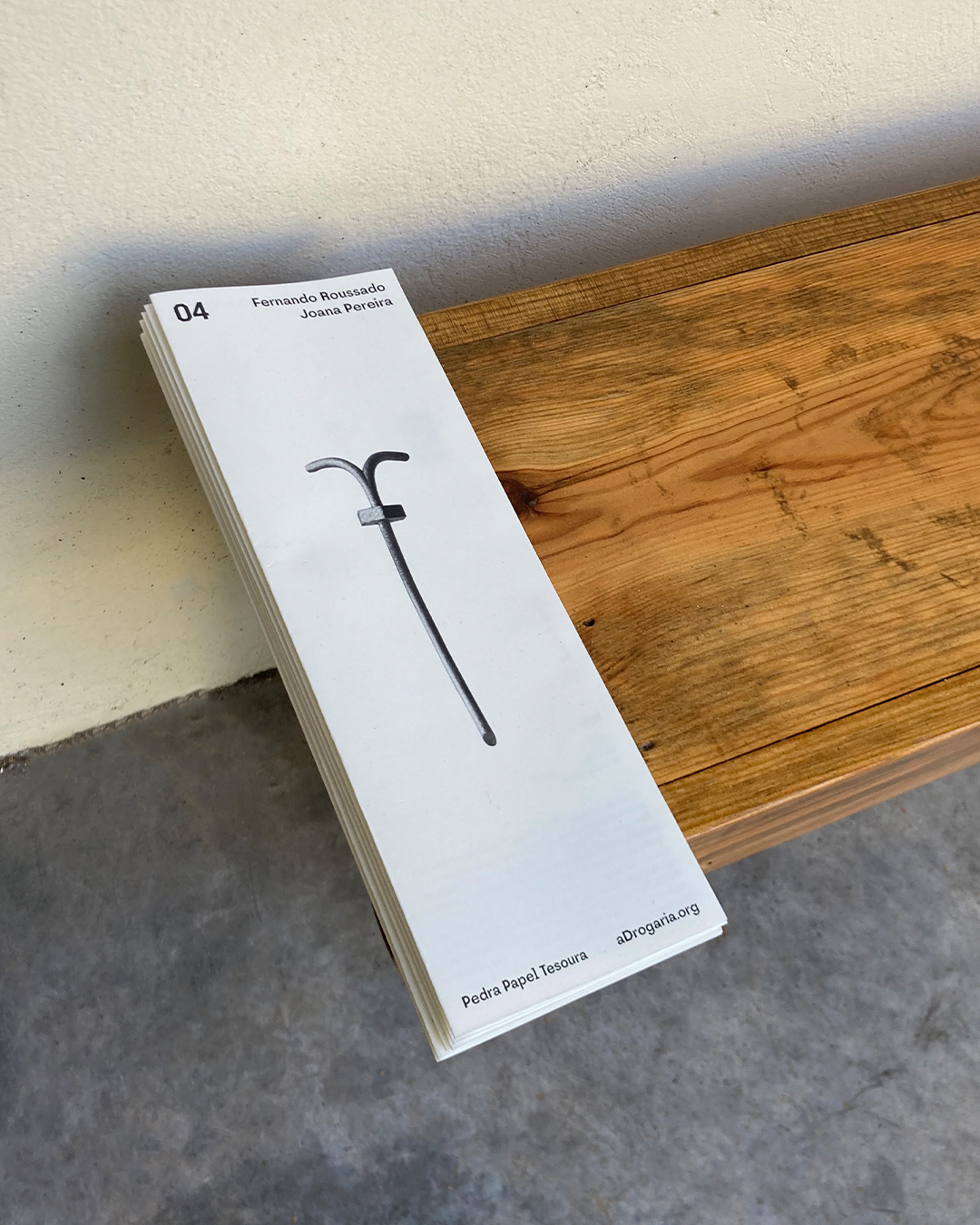
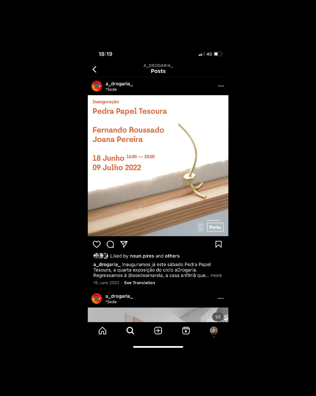
Exhibition Nº 4 — Pedra Papel Tesoura
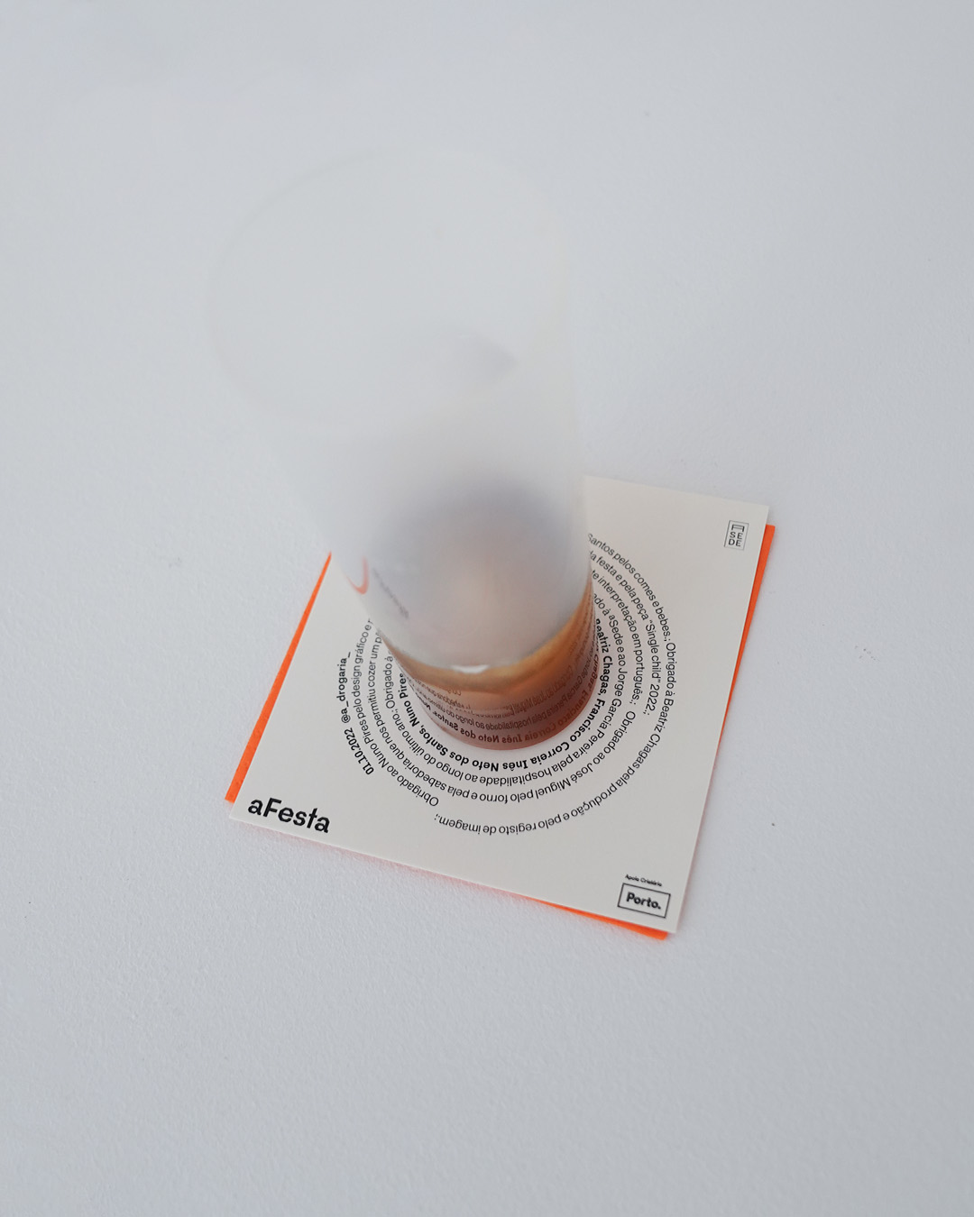
Exhibition Nº 5— aFesta

BRAND STRATEGY
VISUAL IDENTITY
GRAPHIC DESIGN
ART DIRECTION
NAMING
CAMPAIGNS
COPYWRITING
PHOTOGRAPHY
EDITORIAL DESIGN
WEB DESIGN
RETHINKING DESIGN ON SHAKY GROUND
Porto ︎︎︎ Brussels
Working worldwide
Portuguese–English
︎ Terramoto [noun] Earthquake
Porto ︎︎︎ Brussels
Working worldwide
Portuguese–English
︎ Terramoto [noun] Earthquake